
Clean energy incubator
Halliburton Labs harnesses the scale and reach of energy giant Halliburton, to facilitate innovations in clean energy and give participants a springboard. The brand idea is dualistic: combining creative freedom and logistical frameworks – or innovation and execution. The brand mark emerges from a simple framework, through which unlimited graphic combinations can be created – a dynamic visual language that always returns to the underlying form of the monogram HL. This project won silver at the Transform Awards: best visual identity in the energy sector.
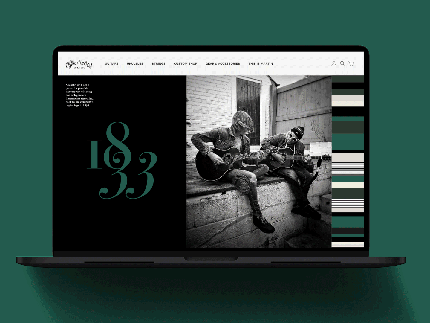
Martin Guitars
A brand with a remarkable heritage in music, Martin has made guitars for many of the greatest players the world has seen: their instruments are famous for their inimitable tone. Approaching their second centenary, they were looking for a visual identity befitting their history, as well as their deep love for music, craft and the creative life. We created a brand that is musical and expressive – steeped in culture and creativity. Retaining their distinction, but absolutely modern: a brand that is flexible enough to be both super-premium and accessible to all, with a rock’n’roll attitude. This project won silver at the Transform Awards: best visual identity in the manufacturing sector.

Wellness retail brand
Visual identity and brand toolkit for Haven Wellness, an integrated retail space and centre for well-being. A calm, balanced and minimally luxurious brand was created to truly reflect the business ethos. Elegant typography elevates messaging around self care, ethical practice and community. A luscious colour palette gives the brand flexibility and emotional range. Haven has since won Best New Business at Croydon Awards.
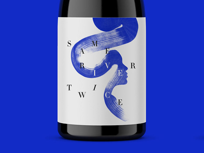
Artisanal wine packaging
Wine label, packaging and merchandise inspired by the pre-Stoic philosophy of Heraclitus, who wrote ‘No man ever steps in the same river twice, for it’s not the same river and he’s not the same man.’ James is a winemaker with a deep interest in philosophy and traditional wine production techniques. After developing the name, I created a hand-painted illustration to speak of an ever-evolving personal identity and a life journey that flows like water.

Financial services brand
Brand identity, website and guidelines for this pioneering asset manager, the first in the world to deal in catastrophe reinsurance and climate resilience. Nephila offers investment products that are uncorrelated to traditional markets, and the essence of the business is born from a completely different perspective. At the centre of the visual identity is a brand mark that turns the scene on its head, revealing a new point of view.
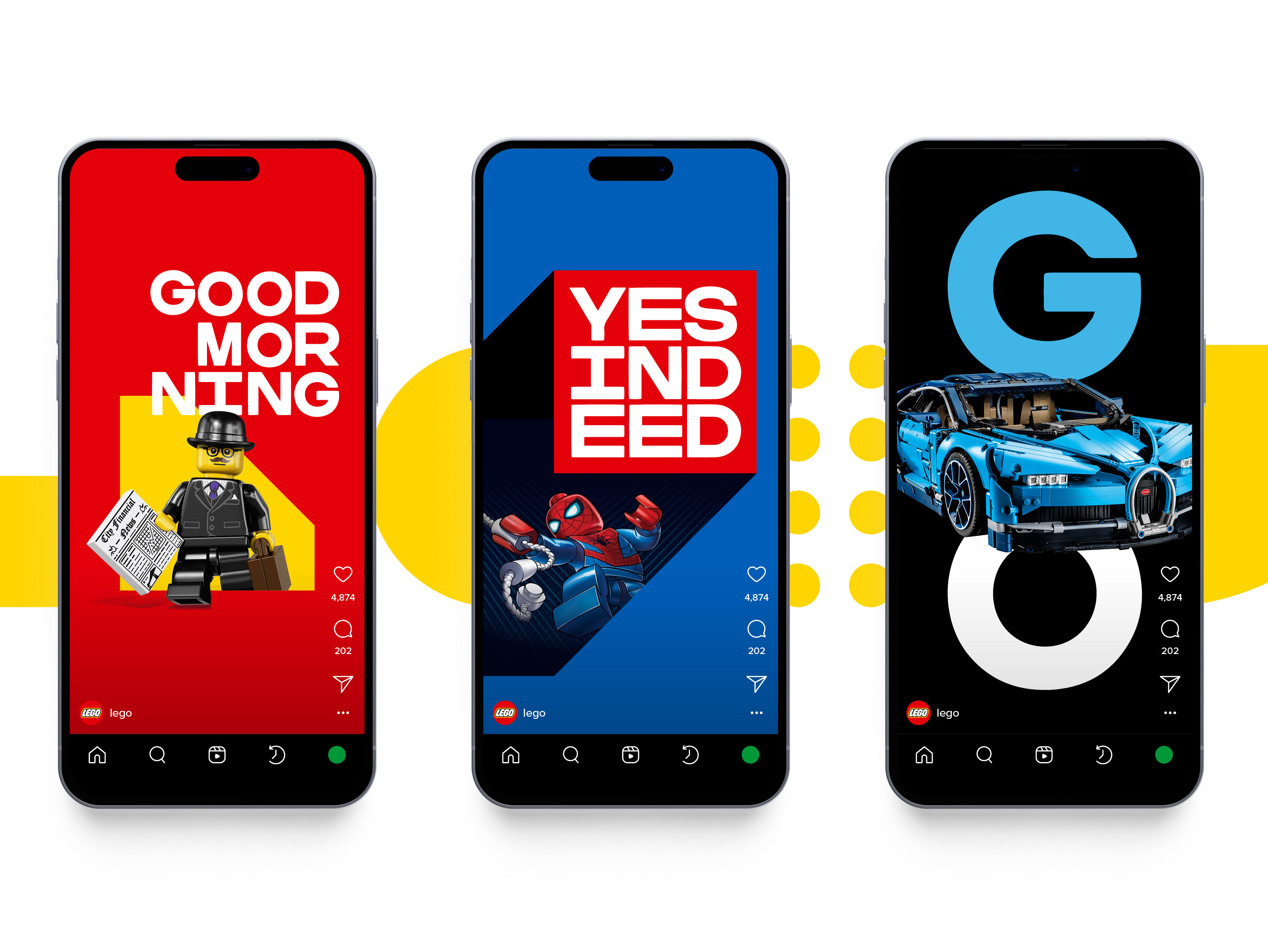
LEGO visual identity
A brand refresh for the world's most iconic toy maker. Expressing a world of limitless imagination – where you can play, learn and live well. The iconic red square remains at the heart of the design system, and alongside it emerges a suite of playful, modular graphics inspired by the timeless forms of the LEGO product. The graphic elements, typography and dynamic colour palette work in limitless combinations to create an ever-changing, ever-evolving identity that reflects the wonderful spirit of LEGO.
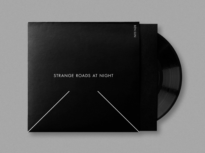
Record label identity
Brand identity, cover art, merchandise and advertising for Voyeurhythm Records, an underground dance music label based in London. Reflecting the feeling of the music, the visual language and imagery has a minimal, analogue feel. The brand is underpinned by the enigmatic VR logo, designed to work as projection, stencil or stamp, in line with the DIY nature of independent music.
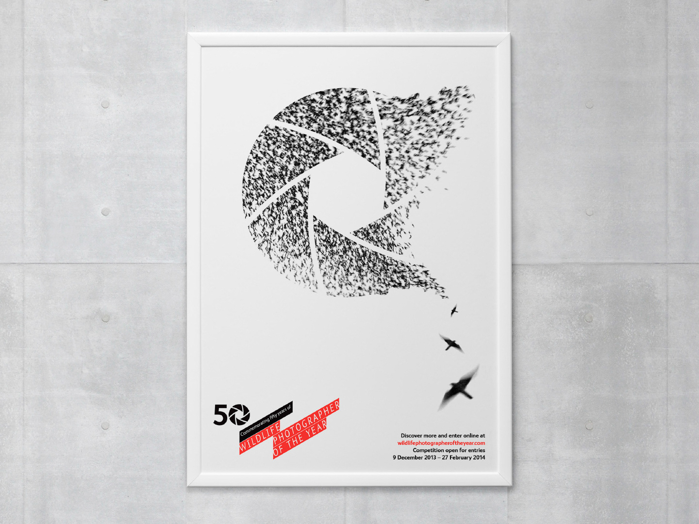
Campaign brand
Advertising and communications for the 50th annual Wildlife Photographer of the Year awards. The 50 ‘aperture’ device was designed to augment the existing WPY branding, giving the event a dynamic and recognisable identity.
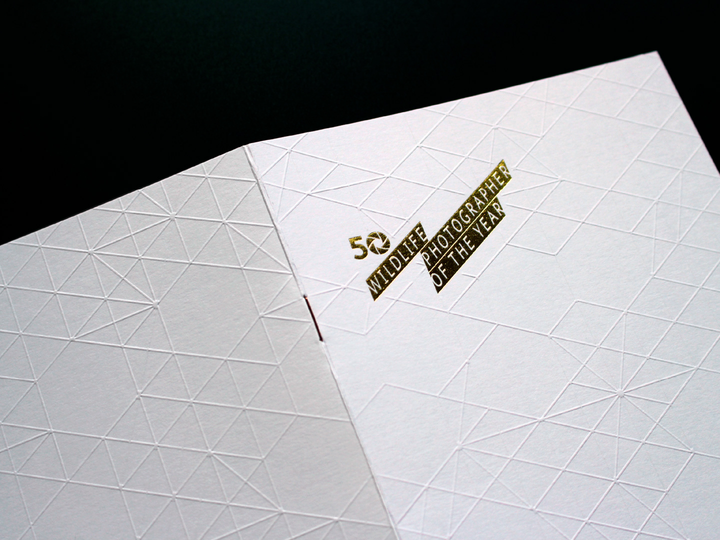
Event branding
Invitation and bespoke print materials for the Wildlife Photographer of the Year award ceremony at London's Natural History Museum, attended by people such as Sir David Attenborough and the Duchess of Cambridge.
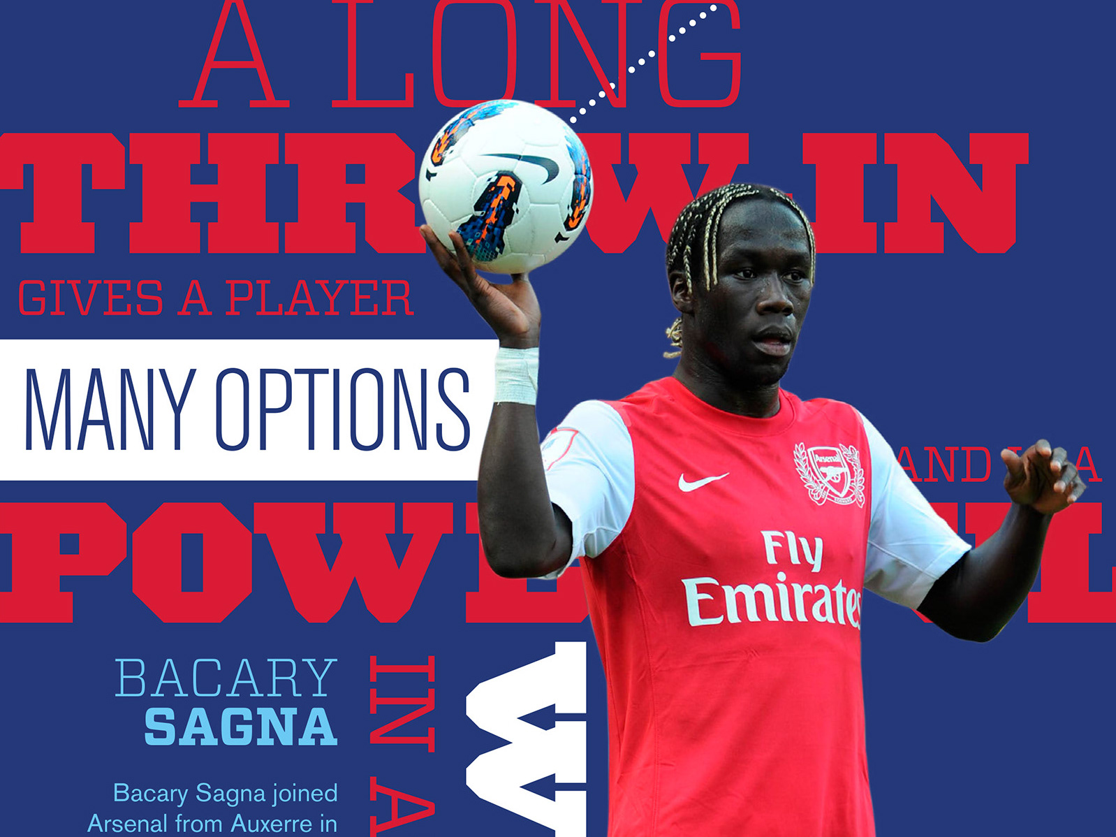
Arsenal x Institute of Physics
A set of educational materials for teachers, students and coaches. The curriculum was designed to teach students how to turn knowledge of physics into an advantage on the football pitch. Created at Chacha Design.
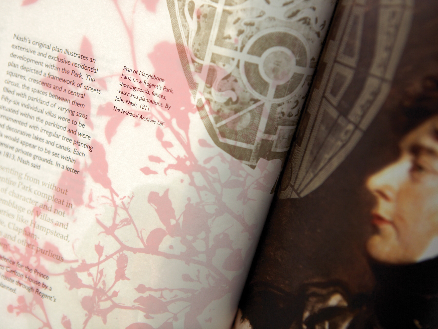
Illustrated literature
A book celebrating the 75th anniversary of John Nash’s design of Queen Mary’s Gardens, the world-famous rose garden in Regents Park. Fine bible paper was french folded and printed rose red on the inside to exploit its petal-like nature. Created at Chacha Design.
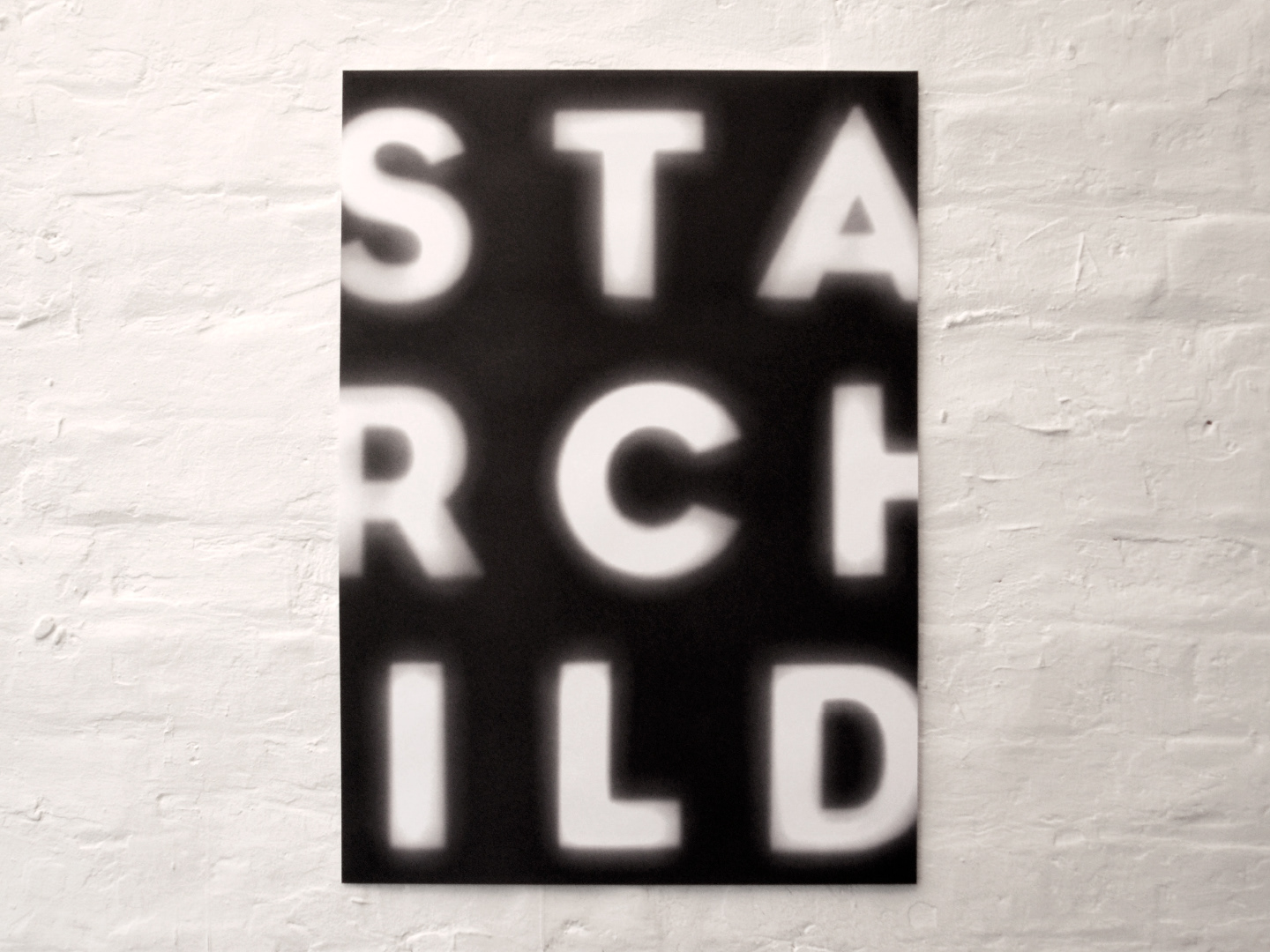
Film company identity
Starchild wanted an identity that captured the cinematic aesthetic of classic science fiction. I created a set of light-based letterforms that reflected the scale and dramatic visual impact of a cinema experience. Stationery was cut out of large lithographic posters, producing a dark-yet-playful variety of letter combinations.
Select client list
A selection of the some of the better-known clients I have worked with, on projects which are not yet featured on the site. If you would like to view some of this work or find out more about my role on the projects, please get in touch via the contact page.